
Cora
4th Year GDMA Case Study Project
Branding / Case Study
Project
Create a new identity that better serves the client, accompanied by a graphic standards booklet and supporting assets.
Background
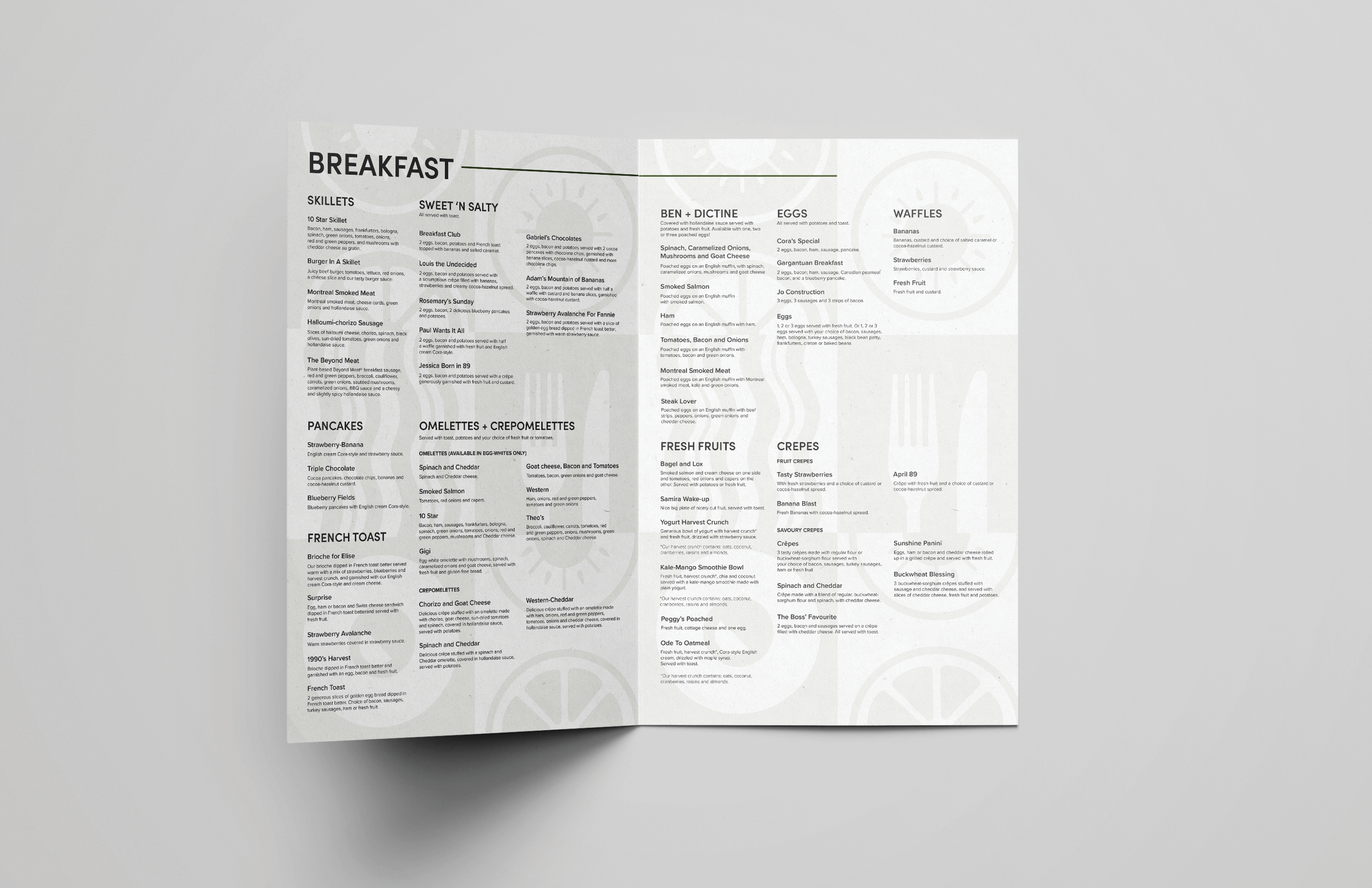
Cora Breakfast and Lunch, a Canadian favorite since 1987, is known for fresh, healthy, and beautifully presented dishes. Celebrating the importance of breakfast, we serve vibrant meals in a warm, family-friendly atmosphere.
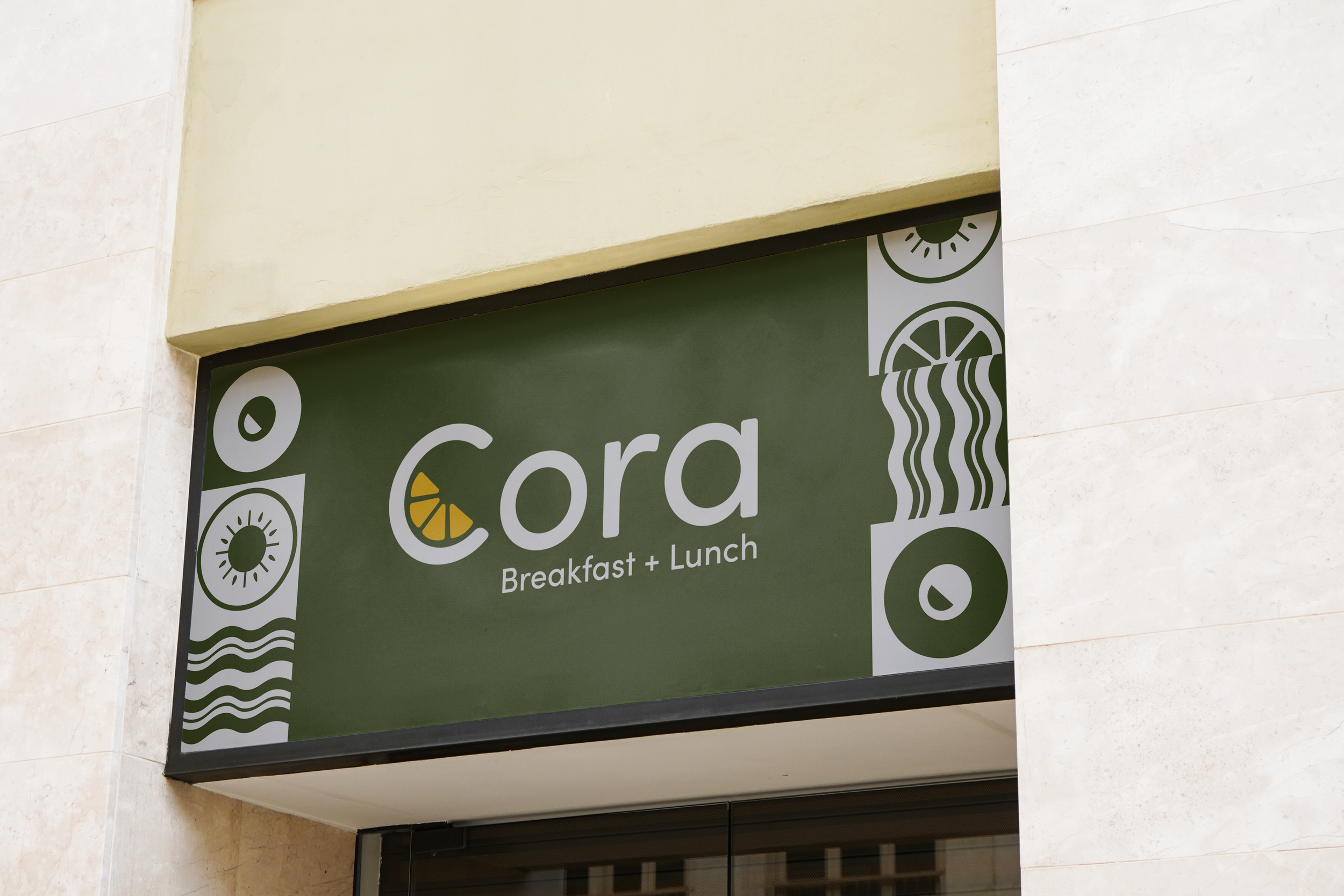
Current Logo for Cora
Visual Identity for Cora

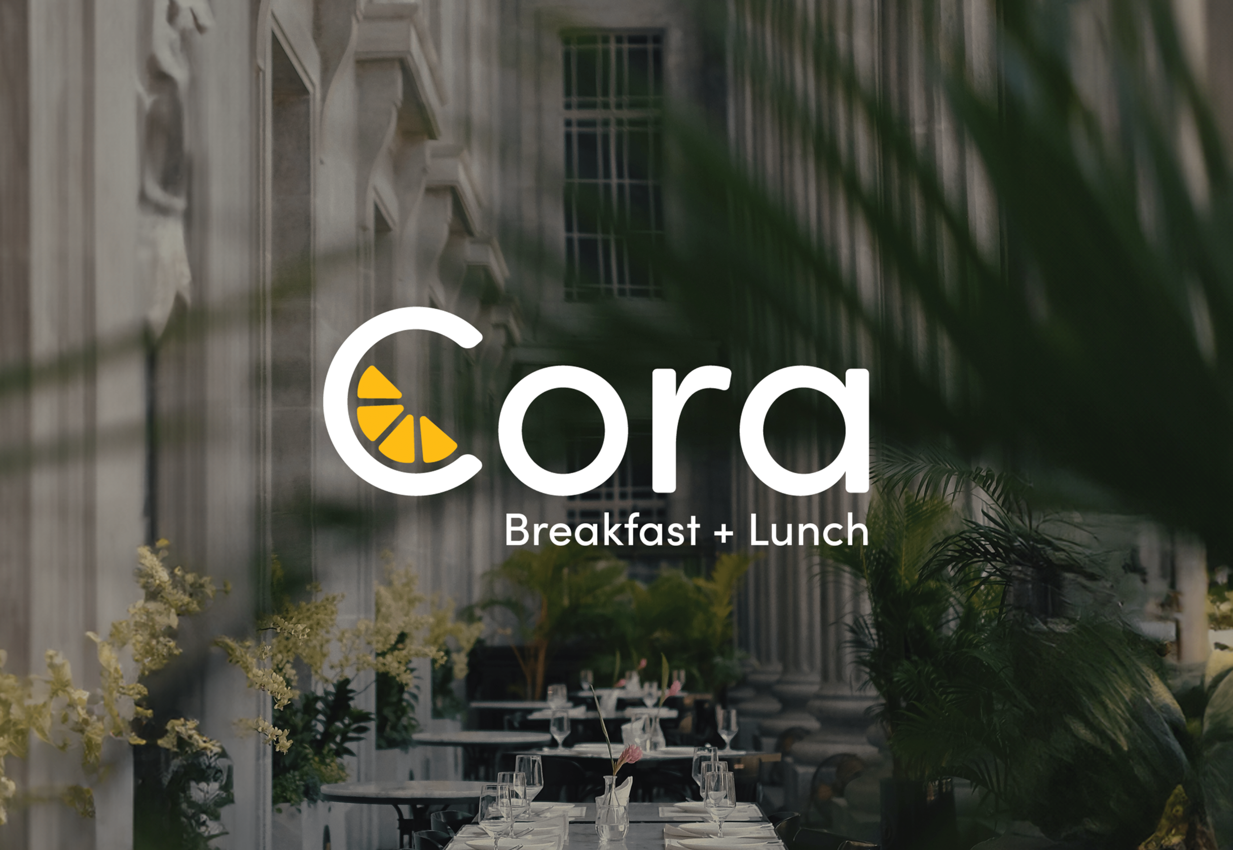
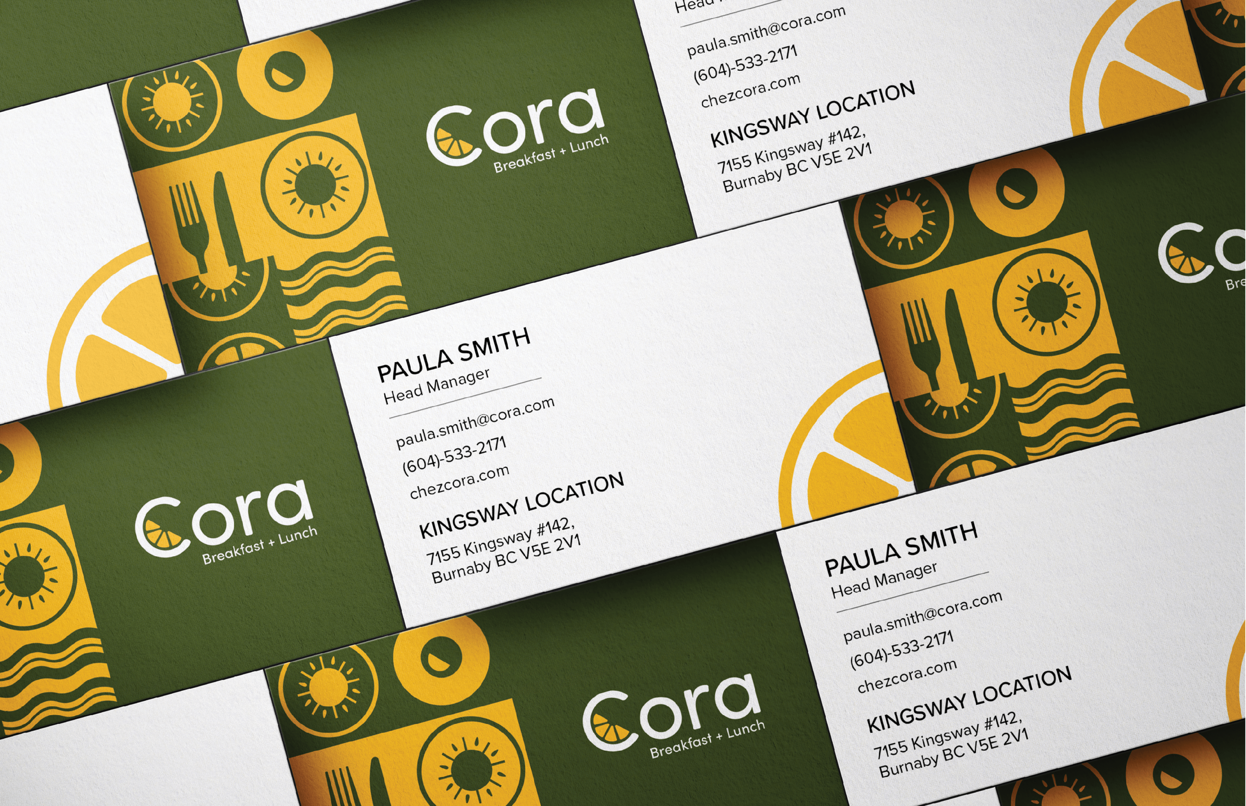
Logo (Vertical)
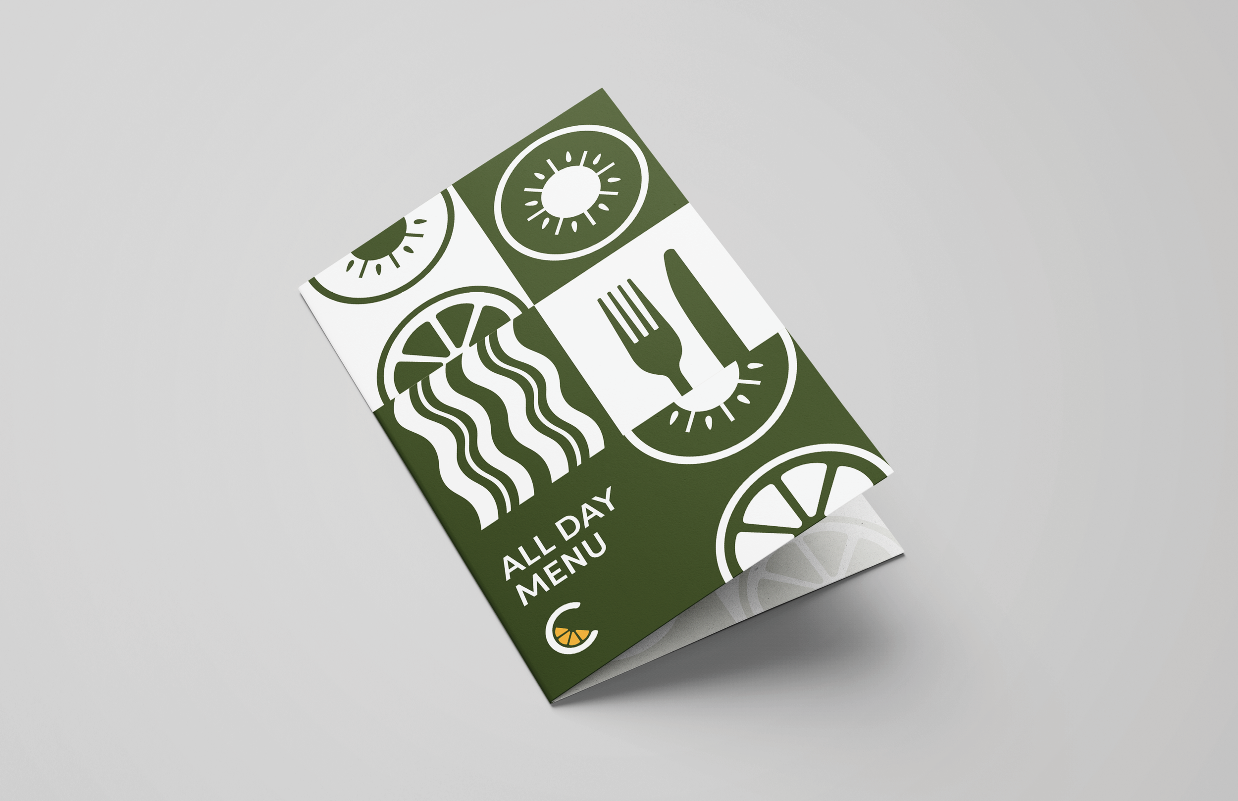
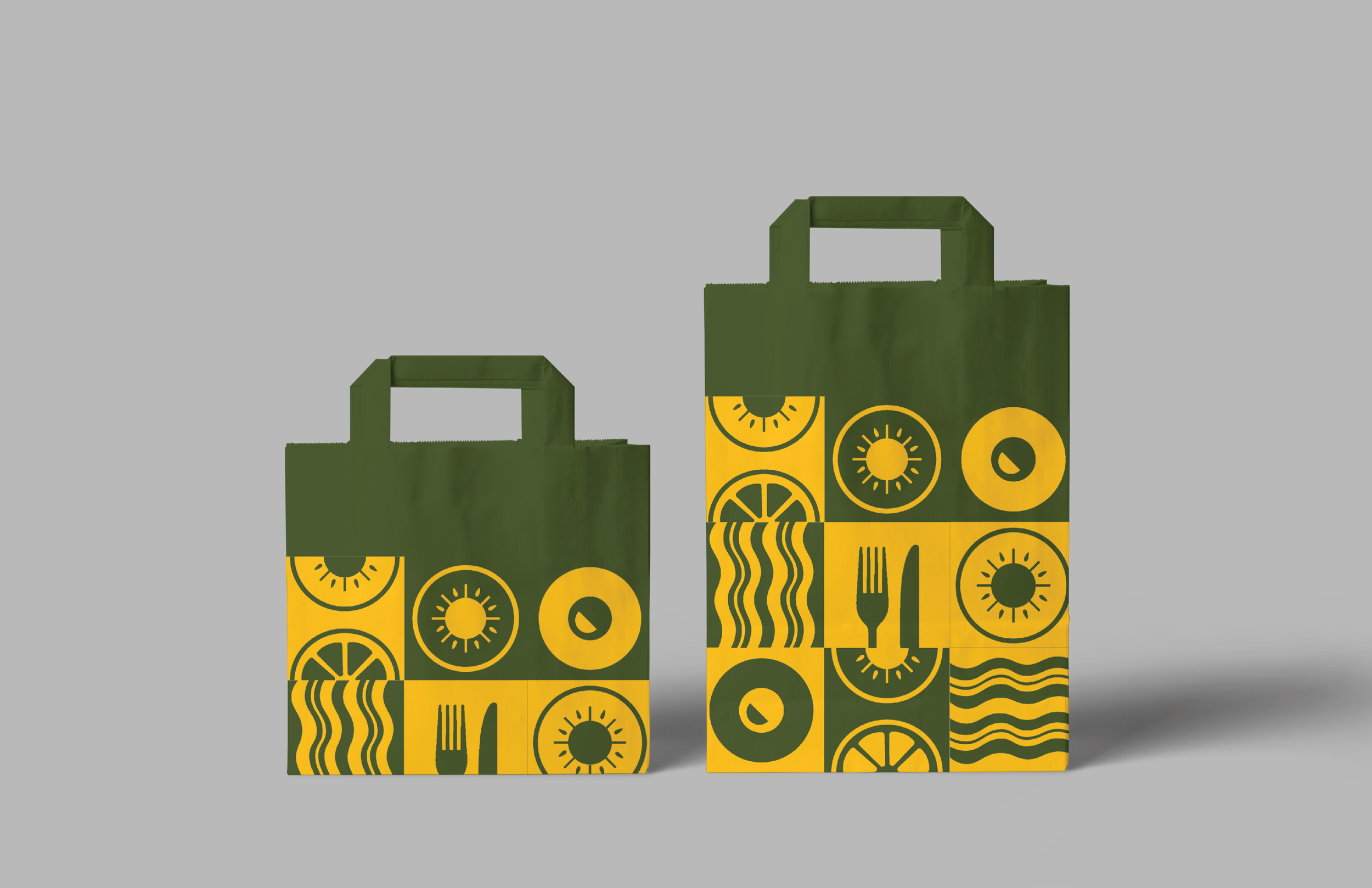
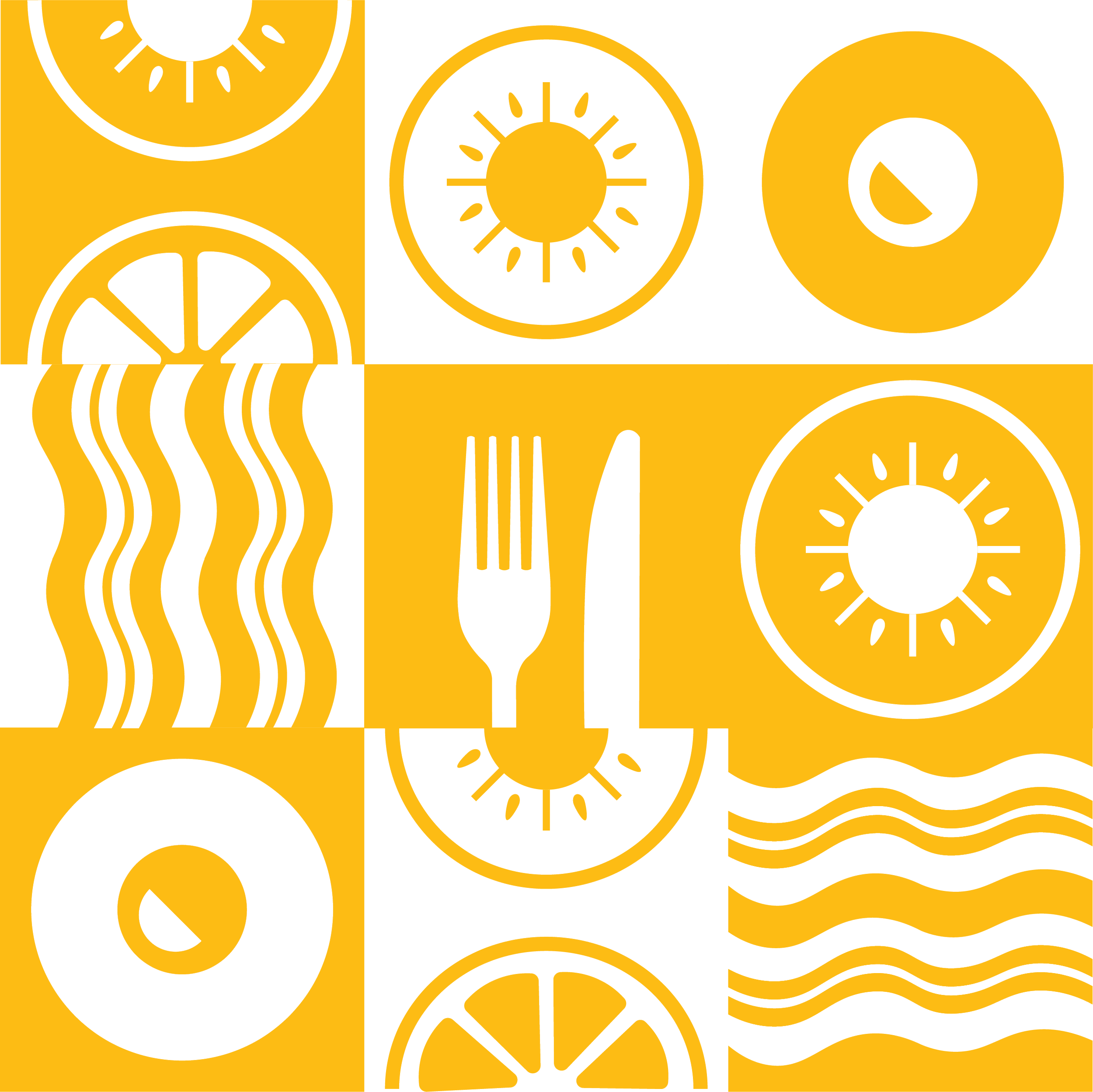
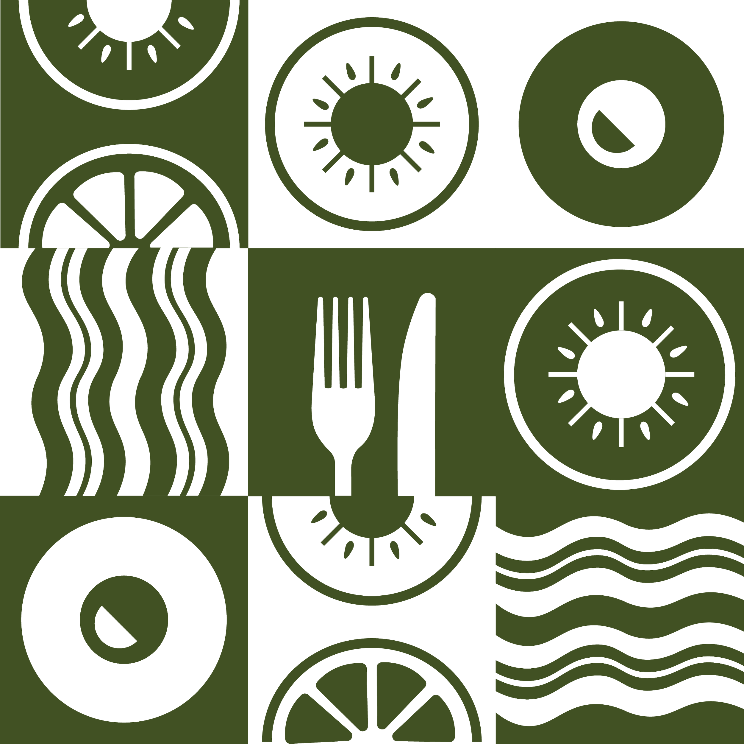
Illustrations (Fresh fruits, Bacon strips, Sunny side-up eggs)
Egg Yolk Yellow
HEX: #FFFFF
R:0 G:0 B:0
Logo (Horizontal)
Rosemary Green
HEX: #FFFFF
R:0 G:0 B:0
Egg White
HEX: #FFFFF
R:0 G:0 B:0
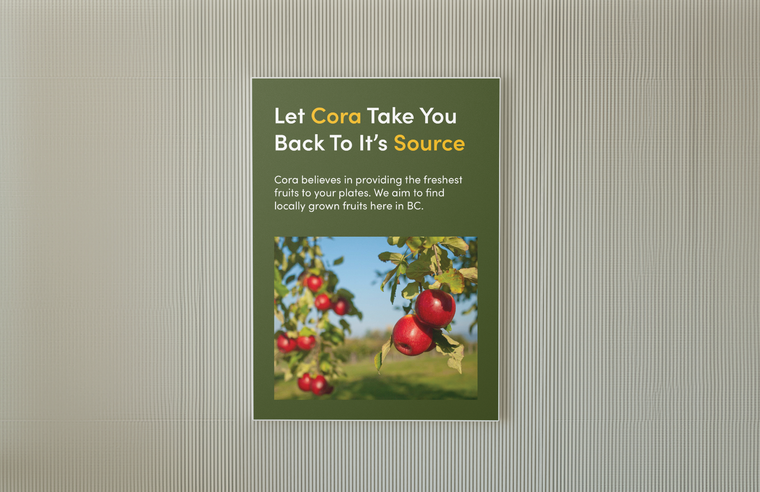
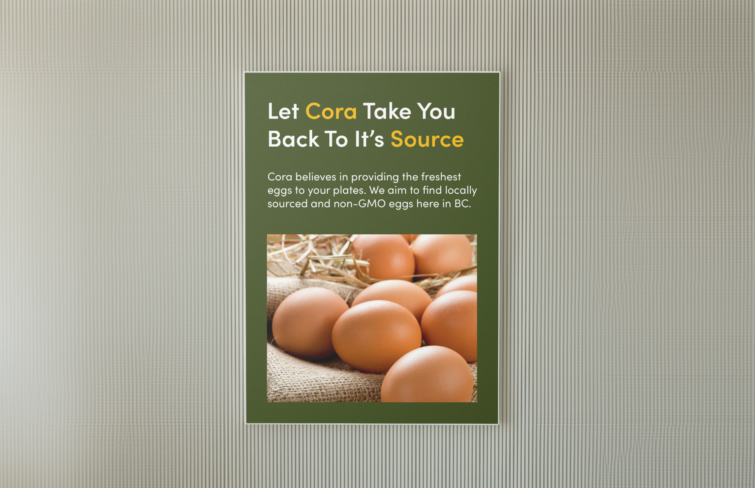
Strategy + Solution
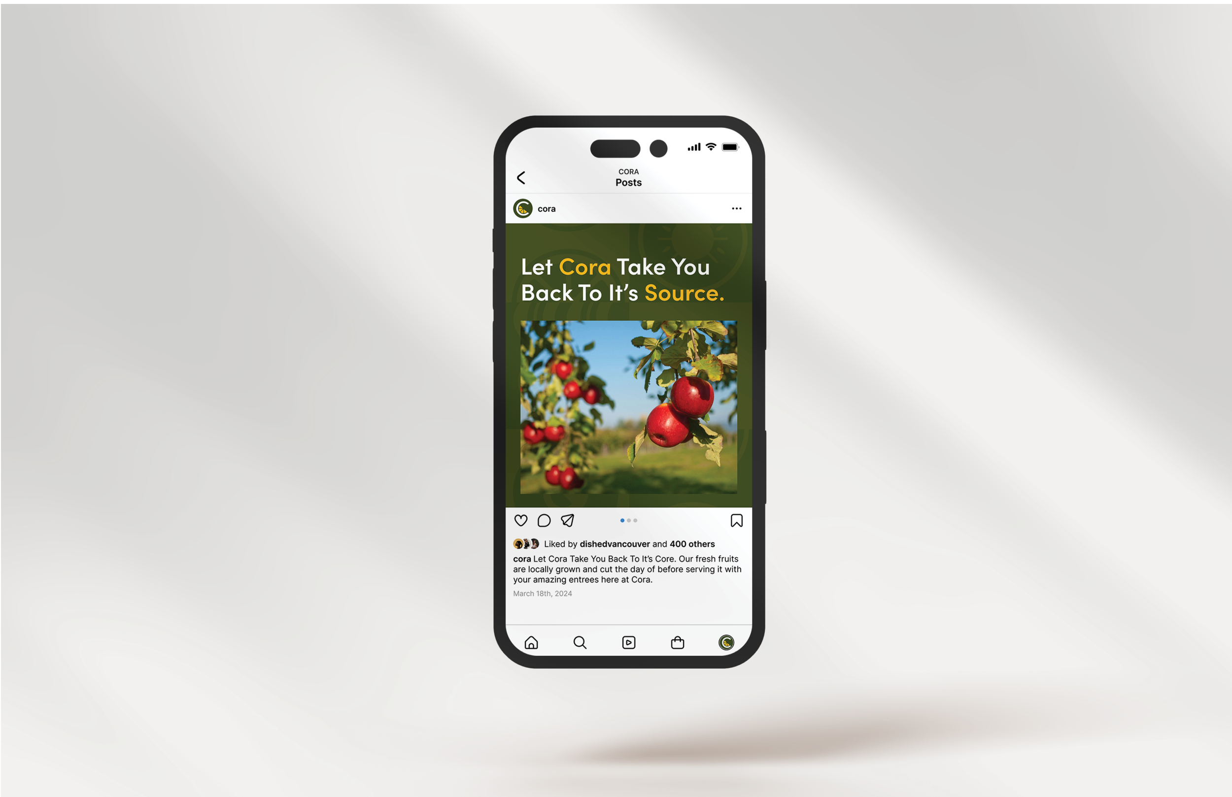
Cora Breakfast and Lunch’s rebrand celebrates the joy of wholesome, fruit-forward breakfasts while honouring its legacy as a beloved Canadian staple. Centered around the tagline “Let Cora Take You Back to Its Source,” the refreshed identity highlights quality ingredients, fresh produce, and beautifully presented dishes. A redesigned logo featuring “Breakfast + Lunch,” with an orange-slice “C,” and a deeper green palette paired with black and white broaden the brand’s appeal. Geometric illustrations and custom patterns of breakfast staples complete a look that feels fresh, simple, and true to Cora’s essence.